Is there any plan that when we will taste this amazing new UI? ![]()
Nothing definite as yet that we’ve heard
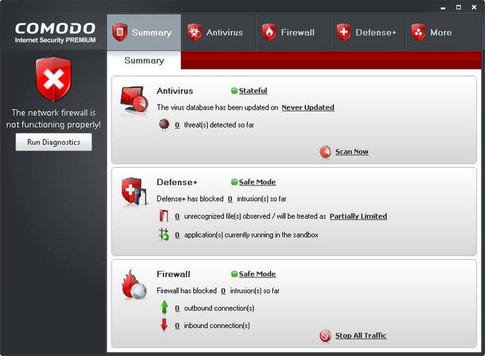
I hope they will still offer the ‘Advanced View’ of main interface with more information such as Unrecognized Files, Contained Apps, Blocked intrustions, etc. Some screenshots of it would be nice to have.
Probably it will take a while to release a CIS build with this new interface, judging by the screenshots such as this one which contains placeholder text, those Screenshots seem to be a work in progress from graphical department and are not even finished yet, implementing a new interface into CIS will require coding and testing for possible glitches and if all buttons/options work as expected.
Most likely the next CIS build will just contain minor Bug fixes while they are working on this new interface and also on the Light AV Database feature.
Guys, this topic is about the new UI so please stay on topic. We do not want this to be another feedback topic about other aspects of CIS.
I appreciate what you are saying, but I want to make feedback to those expending effort on the GUI, that many of us would prefer more effort on fixing core issues rather than yet again fiddling with the GUI.
Can I have more screenshots of the new CIS?
There are too few screenshots to evaluate. In general, it looks pretty simple. Cheap. Inexpressive. This is bad. Most programs look really bad these days. Flatness and minimalism make them squalid. For some reason, they are trying to keep up with Windows 10 in their own degradation. There is no need to degrade along with the rest. The CIS has always been special. Do you want to be “like everyone else”?
In the latest versions of CIS I use “Classic Theme” - in my opinion, this is the most beautiful theme. The rest are poor in their minimalism and flatness. I think we need to do more volumetric elements and some effects.
I hope these themes will be full screen? I would like to see screenshots of the settings and the widget.
Functionality is also important. Will there be additional modes for displaying basic information?
Hello everyone,
Thank you all for your comments. We are checking all of them. Here is the light theme examples attached.
Regards,
Zeynep.
The first thing that jumps out is that the main ‘icons’ are huge in comparison to their content. They all need more information, such as what are the states of the Firewall, the AV or HIPS etc.?
How is the PC Protected . . . Why is the PC Not Protected?
For instance I use the Classic View with CIS and everything is there on the main screen. I don’t have to click any other icons unless I want to change the state of a particular component.
The overall concept is great and maybe that’s what you’re looking for in the feedback with the extra information to be added quite easily later?
I have got used to the current GUI and the themes, have it set to classic, but this has been my favourite GUI so far, but doubt it will revert back to this ![]()
+1
Huntokar,
I also like this design, but I think there will be no return to it (
Overall style is nice but the data presented to the user is extremely lacking.
Where are all the stats?
If you are not going to include them on the main page, then at least create a separate page for them.
UX is about increasing the user experience not degrading it.
See my previous comments.
New skins are disgusting and unintuitive. Answer directly Modern and Classic Theme will remain or is this bad taste now a sentence?
The new layout is very ugly … it can be installed on a PC not on a smartphone or tablet …
It seems to me more themes from a smartphone or tablet … :-TD :-TD :-TD
CIS is principally a Windows-based PC security system, so why are you designing a UI that looks better on an Android-based phone or tablet but juvenile and childish on a Windows-based PC?
CIS is not a tool for the novice or average user. You might want it to be but it’s just not. It’s like giving a child a loaded gun. CIS is a PC security system for users who already understand a fair amount about how their PC works, about how the Internet works, and even about how Windows works. What these users want is information and a quick and easy way of checking what is going on - the current ‘advanced’ CIS panel does that quite well, and makes it easy to ‘drill down’ to the details of each feature. What needs to change there?
I need the UI to let me see what’s going on and provide logical access to the many controls. I also want the size of the various icons to be commensurate with the 1080p, 1440p, or even 4k displays that more advanced users are using. If I’ve spent upwards of $1000 on a 49" 4k 240Hz QLED super-wide monitor I absolutely don’t want to see a great big child-like and clearly tablet-oriented UI for CIS on there…
The concept of the new graphics must take into account the available high definition 4K
So no need to display large blocks on the interface, rather rely on advanced users with the maximum amount of information
Thank
Not impressed. I agree with many of the other comments. I don’t like the devolved dumbed-down graphics trend toward placating mobile devices. Where’s the vision?
I agree 100%. If anything this kind of interface or the “dumbing it down to make it easier to understand” actually makes things harder to understand for the novice user.
Comodo is a powerful, advanced security program with many features and protection modules, why hide everything away and pretend that CIS is just a simple AV scanner product without any other security layers? This is what a novice user will actually think when looking at this interface… Also don’t help with the fact that Default Settings for CIS are weak and suffering from multiple breaches leading to poor results at SE Labs.uk security tests lately but this is Off topic.
If you are offering such a powerful solution to users, then show at main interface what this product is capable of, instead of hiding everything.
i dont mind having these new layouts… but do not remove the classic layout as an option… i use pc, not smartphone or tablet… i need my softwares to have the less candy and eye things and more texts, informations and acessibility… the old cis default layout, the classical, is still the best… atleast for me…
anyway, ill not stop running cis because some fancy gui…
My opinion is that you should rather work on the content of the application, improving bugs and the detection rate. Then an additional layout would also be fine but leaving the end user the choice to stay on the old (which I really like) or switch to the new. ![]()