Hello, I have a small suggestion that I think many people will find worthwhile.
Currently, Dragon’s UI works well, but more can be done to give the user space to view webpages. The main issue is that the Dragon button on the Left side looks nice but makes the UI too open with not enough potential viewing space.
Currently, Dragon does better to give viewing space than the default Firefox UI, but if we use a Firefox extension called Stratiform, we can tighten up Firefox and compare it to how Dragon could be tightened up as well.
As we see below, the space between the red line and Dragon’s tabs is empty, unused, and potentially useful to a Dragon use if it were utilized.
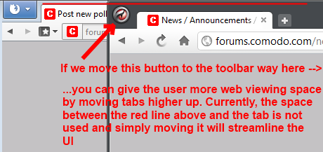
We can make use of this space by doing 3 things:
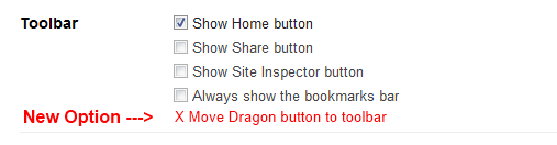
- Adding an option to move the Dragon button to the toolbar where the Share and Site inspector buttons go, as you can see in this picture.
- Once the Dragon button is moved, pull the tabs back so they start where the Dragon button was.
- Push the toolbar and tabs up to give more web viewing space.
Am I making myself clear with this description? I’d photoshop a mockup but I think people get it since its pretty simple.
Anyway, what do you guys think? I’m a fan of very SMALL confined toolbars and tabs in web browsers, so if anybody else feels the same, please chime in!
Hi Calidude,
Your idea is ok but are you running v16.2.1.0?
Why I ask is because mine is already as snug as a bug in a rug.
Win7
[attachment deleted by admin]
Hi Calidude,
I just checked my XP machine and it is also very snug.
In the screenshot that you have shown, I can understand your wish which is very valid.
Is anyone else seeing this wasted space above the tabs?
If yes does anyone know why this is happening on some systems or a fix for it??
Calidude,
I am not intending to hijack your topic which is more of a wish, but more curious as to why the difference and would the wish still be required if you had a tight fit at the top?
Edit: If you would still like this option even if it was snug at the top I will move this to the wishlist after your next reply otherwise I will move it to CD help.
Thanks.
Oh I’m sorry, I should have been more clear. I meant that I’d like it to be snug whether Dragon is fullscreened or windowed. It’s very useful to have that if you own a notebook with a lower resolution so you can keep webspace maximized while still having something running next to the browser like an IM client, etc.
I should have mentioned that. My apologies.
Hi Calidude,
Sorry I didn’t pick up on not meaning full screen, when windowed mine is the same as yours.
I will move this to the wishlist and vote.
Kind regards.
Thanks. I know its a small request, but the little things add up in a user’s eyes.
only if it’s an option but I think it would be better to add the ability to customize the UI as much as you can in FireFox but you probably can’t because of limitations in chromium