Widgets are like toolbars now. I think the age of widgets is over just like the age of toolbars.
I like my widgets in Win7. Stock clock, CPU/MEM usage and weather are nice. But Comodo’s widget has few major problems…
- It’s too wide and stands out from the rest of above mentioned
- Doesn’t snap to other widgets like stock one does
- It looks like a quickly made mess, feels inconsistent
:-TU :-TU :-TU
Version 6 UI is for computer novices - that mean they just install and forget, they won’t use the UI or check info. in the UI.
For those common/advance users who really use the UI, V6 is a plainful experience compare to V5. More efforts to get info, to configure, to answer alerts…
Do widgets dock? If so maybe the CIS widget could be made to dock on request with the file drop area.
Mouse
I agree with this, the new interface is for n00bs, is lacking a lot of info!!
CIS 5 THE BEST!!! :-TU
cis 6 become like all the others … at least the interface and ease of use rather not very convenient. :-[
sadness and sorrow… :-
live forever cis 5!!!
Clueless ppl usually don’t install Comodo or if they do, they don’t even open the main interface. They just expect it to work. But advanced users are heavily handicaped by the interface. So i still stand by the rule that interface should have a nice balance of features and ease of use. And right now it’s way too much on the easy of use. So much it’s not really easy to use for advanced users…
You have my vote too.
I want more info in main window.
There are lots of nice ideas in this topic.
I hope Comodo is going to listen to its users and change it soon.
+100
And what is also missing in CIS 6 is the ability to change the security level of components by right clicking the tray icon. It is more easily and quickly done with the tray icon than by opening the main interface and digging into it.
i have been trying the beta but the interface put me off so i got rid of it and reinstalled 5.
I really don’t like the main UI which gives no information and the garish alerts which actually require more clicks then previous versions.
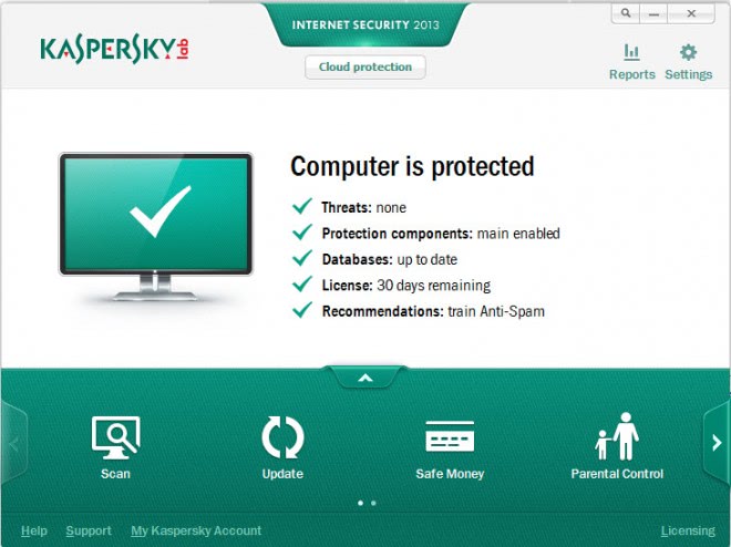
The checkmark is redundant, there’s already the “Secure” notice.
This whole touch biased approach is starting to get annoying.First windows goes and changes windows to make it more touch friendly and screws us keyboard and mouse users and now even my favorite firewall is going the same way.Look i get it touch is the future and all but does it really have to come at the cost of providing enough information to the user.This over simplification of the GUI is not providing enough information that a firewall should provide like traffic activity and blocked attempts.If you are going ahead with this design plz do provide a advanced GUI too for ppl who want info and not snazzy minimalist icons that take up all the usable space on their screen.I love comodo 5 and would like to switch to 6 but till a advanced mode is not added i am sticking to the old reliable desktop friendly comodo.
+1
I also posted a different UI in the usability suggestions thread but apparentely nothing will be done. And this GUI is soooo not practical. Nobody likes it, why keep it!?
This is exactly why I’m still using Comodo System Cleaner instead of the new Comodo System Utilities. I think the UI is truly horrible (in both CSU and CIS).
So … Comodo is the next victim of dumb is better? cough cough Excuse me, I mean, simple is better?
I used Comodo for the firewall, block all ports, make custom rules, purge, and all the good stuff.
With this new interface, I’ll just go and pay for ESET Shmart Shecurity ![]()
Good luck folks!
Hi bakadesu,
Remember this is a new fresh GUI still in Beta form, give it time to mature.
We never know what the future will bring. ![]()
i posted a similar suggestion months ago
…
but saddly it looked like no anyone is bothered about the useless new interface which says nothing
that is the main reason to why im planing to stick to v5
Now what is this?
:o
Did they copy us or did we copy them?
Well is 99,5% same interface. I hope the final one will be a bit different, and why not a bit more practical.